

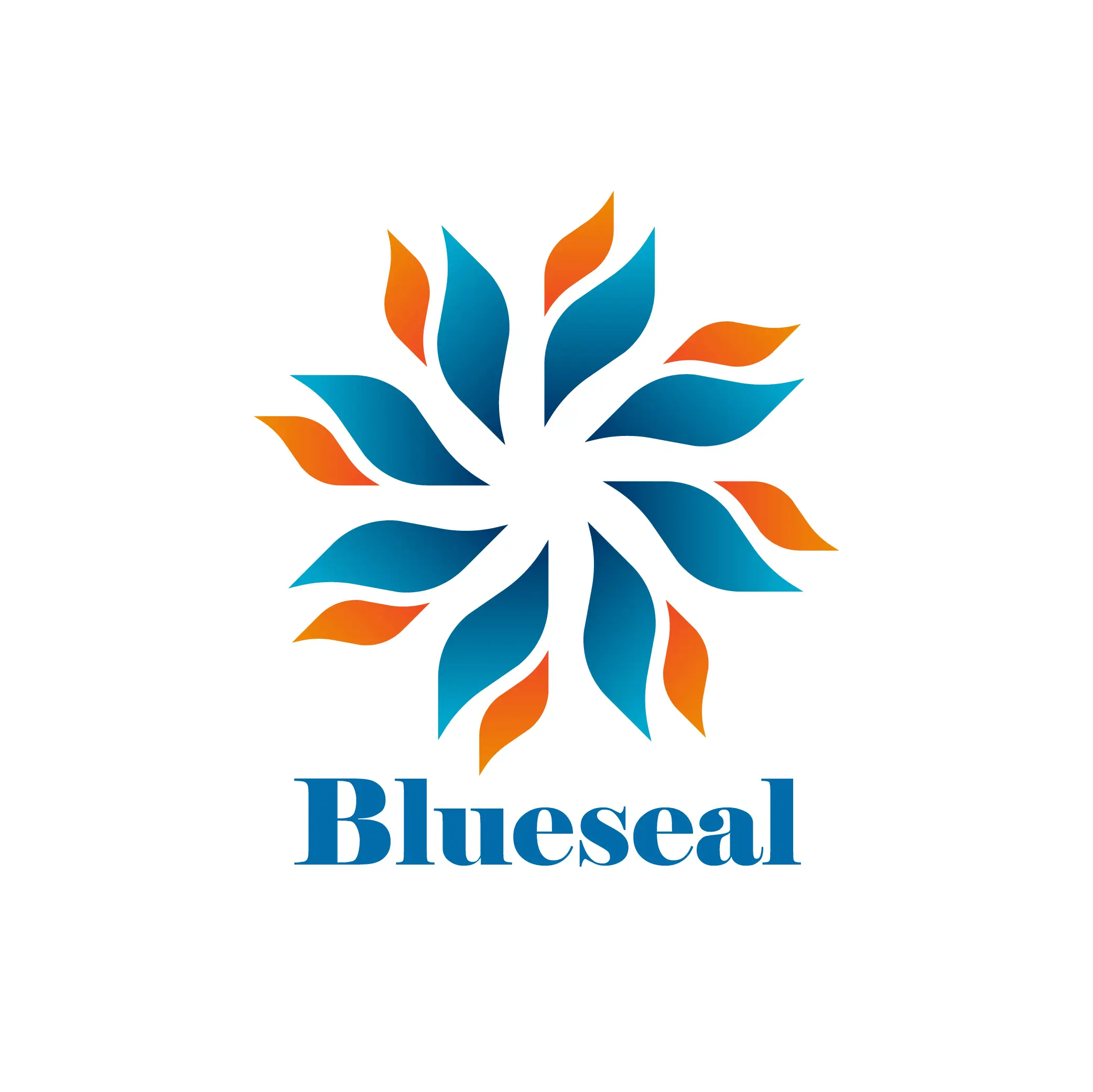
Blueseale Logo Design Concept – Powerful Blueseale Logo Design
The Blueseale logo design was created to represent strength, innovation, and energy for the oil industry. Inspired by the natural flame of fire, the Blueseale logo design combines blue and orange tones, symbolizing both trust and dynamic growth.
This creative approach ensures that Blueseale stands out in a highly competitive market.
Meaning and Inspiration Behind the Blueseale Logo Design
The flame shape represents energy and progress, while the chosen colors highlight the company’s core values:
- Blue (#026B9A): Trust, stability, and professionalism
- Orange (#E96D13): Energy, creativity, and growth
- Deep Red (#9F213): Strength and determination
This balance of colors and shapes makes the logo a strong identity for Blueseale.
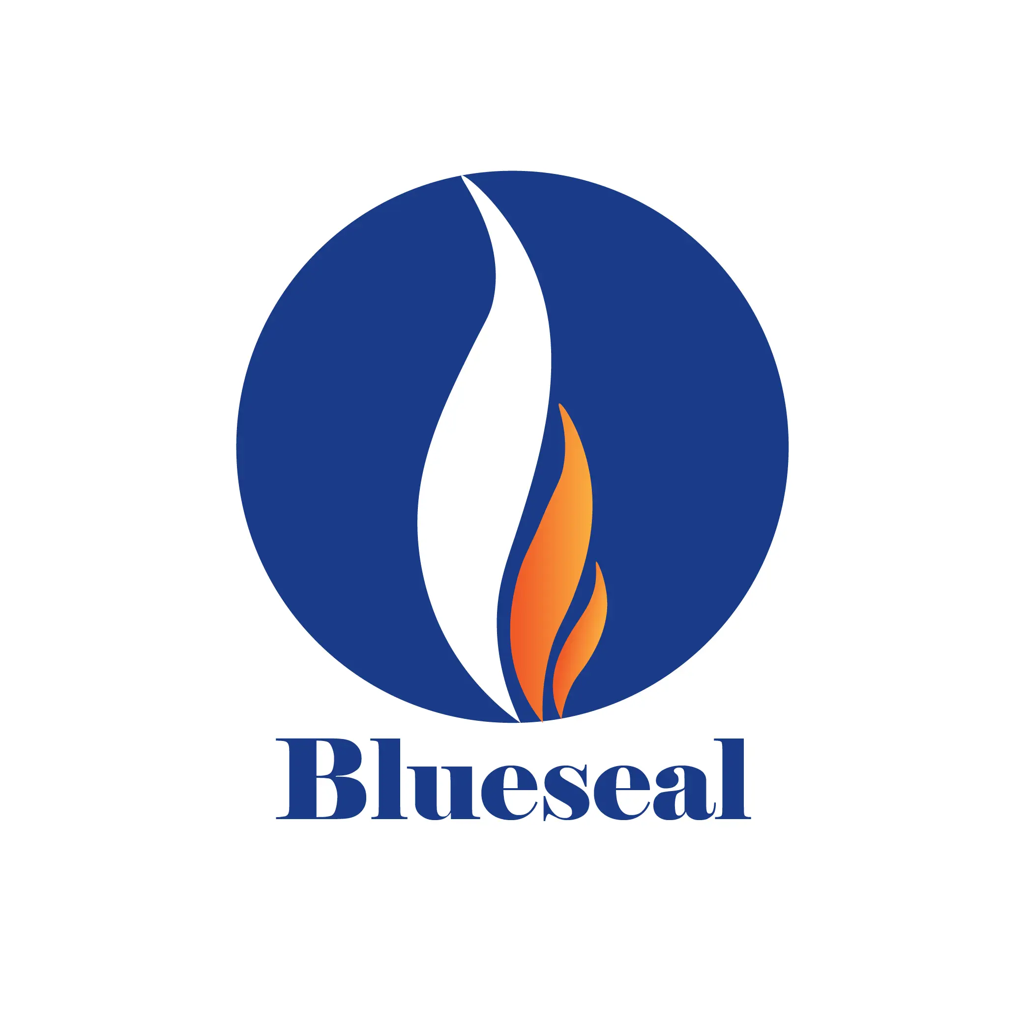
Why This Logo Works for the Oil Industry
Logos in the oil and energy sector need to symbolize both power and reliability.
By using the fire flame concept in blue and orange, Blueseale’s logo connects with its audience emotionally while staying professional and memorable.
K1 – Turning Ideas into Brands
At K1, we believe every business deserves a powerful identity. Our team specializes in transforming ideas into impactful logos and brand strategies. The Blueseale project is just one example of how we deliver creative solutions that help companies grow.
Explore top branding and logo design inspirations to see how innovative concepts can elevate a brand.
