

Key One Logo Design – A Blend of Luxury and Creativity
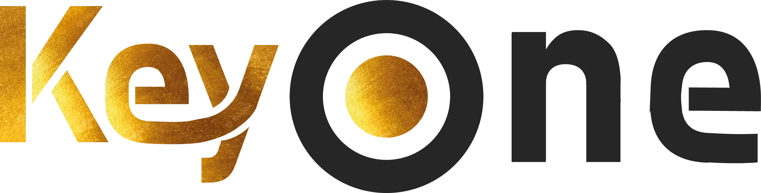
The Key One logo design represents the perfect balance between creativity, modern branding, and luxury aesthetics. Inspired by the concept of a “key” and “one,” the typography combines elegance with symbolism.
The “O” in One has been uniquely designed to resemble a target, symbolizing precision and focus in the digital marketing world.
Meaning Behind the Colors and Typography
Gold was carefully chosen as the primary color (#CB8918) to reflect luxury, success, and premium branding. Paired with the deep secondary tone #262626, the logo delivers a professional and timeless look. The clean typography ensures strong brand recognition while maintaining elegance.
Why This Logo Works for Digital Marketing Brands
In this logo project, we aimed to deliver the brand message in a way that aligns seamlessly with the company’s digital marketing services.
The Key One logo is more than just a visual identity. It highlights the company’s vision: providing high-quality digital marketing solutions for businesses worldwide. Its luxurious design speaks to brands that value professionalism and creativity.
Discover more about modern branding in HubSpot’s branding guide.
